AI vs. the Swedish Scholastic Aptitude Test: How Did 17 Small Language Models Handle the Verbal Section?
Publicerad May 2, 2025 av Joel Thyberg

Testing Small Language Models' Swedish Comprehension via Ollama
This text presents a study on how well various small language models, available through Ollama, understand the Swedish language. It is particularly interesting to examine smaller models because they can often be run locally, even without access to powerful computing resources. This offers several key advantages: the ability to use the models completely offline and significantly enhanced data security. When models run locally, no information being processed needs to leave the user's own computer, eliminating the risk of what is written being disseminated externally.
Test Methodology
To conduct this test, 17 different language models available via Ollama were downloaded and tested. These models could be run locally and had parameters ranging from 3 to 8 billion, with file sizes between 2 and 5 GB.
A local chat interface was built to interact with each individual model.
The same set of questions was then posed to each model. The questions were taken from the verbal section of a recent Swedish Scholastic Aptitude Test (specifically 30 questions from Test Pass 4, Spring 2024). The verbal section of the test typically consists of 40 questions:
- 10 questions on word comprehension (ORD)
- 10 questions on Swedish reading comprehension (LÄS)
- 10 questions on sentence completion (MEK)
- 10 questions on English reading comprehension
Since this test specifically focused on the models' Swedish language comprehension, the ten questions pertaining to English reading comprehension were excluded. Each model thus had to answer a total of 30 Swedish verbal questions, with one attempt per question.
Results
After all models had answered the 30 questions, the results were compiled, as you can see below.
 Figure 1: The chart shows the total number of correct answers (on the y-axis) per tested model (along the x-axis).
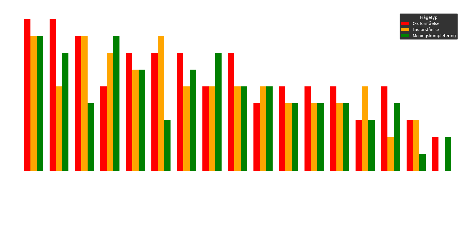 Figure 2: The chart specifies the number of correct answers for each sub-section: the red bar represents word comprehension, the orange reading comprehension, and the green sentence completion.
The results clearly show that the model qwen2:7b performed best, with 25 correct answers out of 30. This model is followed by gemma:9b, which achieved 21 out of 30 correct answers. Thereafter, command-r:35b and deepseek-coder-v2:16b share third place, both with 20 correct.
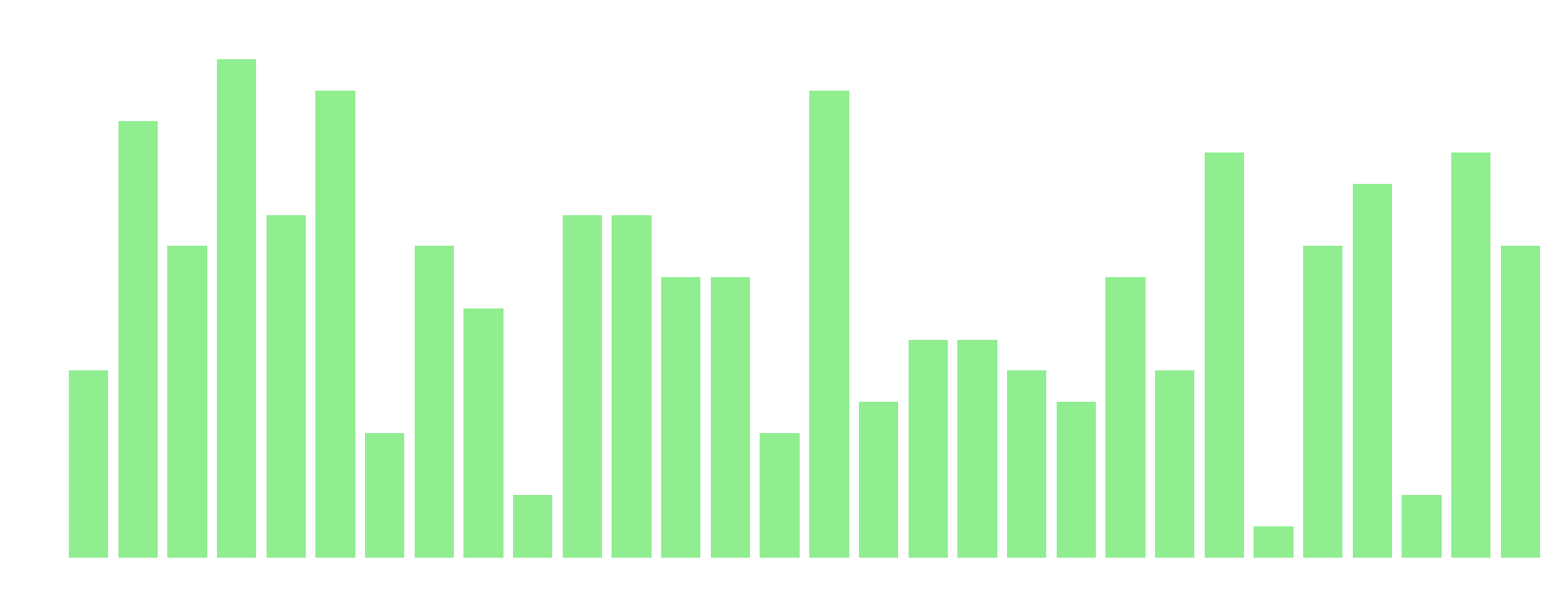 Figure 3: The chart shows the number of models with correct answers on the y-axis and the question number on the x-axis.
From the charts above, we can see that question 4 was the easiest for the models, while question 25 was the most difficult.
Question 4 (Easiest): Välj det alternativ (A-E) som bäst motsvarar betydelsen av ordet "intervention".
- A. avbrott
- B. stödfunktion
- C. ingripande (Correct answer)
- D. förmedling
- E. inaktivitet
Question 25 (Hardest): Välj det alternativ (A-D) som bäst passar in på platsen markerad med X i meningen/meningarna.
"Det som oroar forskarna är inte att höghastighetstågen kommer att få järnvägsbroarna att rasa, utan snarare att broarna inte kan trafikeras i så höga hastigheter med X spårstabilitet. Dessutom lär kostnaden för underhåll X om spåren på broarna måste justeras var och varannan vecka."
- A. beräknad – komma till korta
- B. likartad – mana till eftertanke
- C. tillförlitlig – tas i anspråk
- D. bibehållen – skjuta i höjden (Correct answer)
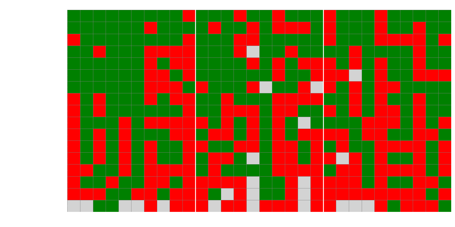 Figure 4: The chart shows a heatmap of whether the models answered correctly (green box), incorrectly (red box), or not sensibly at all (grey box) for the different questions.
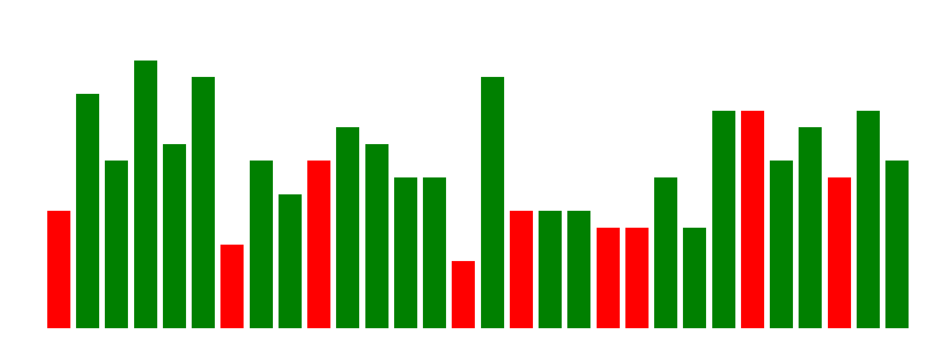 Figure 5: The chart shows the most common answer for each question, and whether the most common answer was correct (green bar) or incorrect (red bar).
An interesting observation from Figures 4 and 5 is how the models tend to act when they answer incorrectly. The heatmap (Figure 4) shows that some questions were consistently difficult for almost all models. When we then look at the most common answers (Figure 5), we see that for many of these difficult questions, the majority of models choose the same incorrect answer alternative. This indicates a remarkable uniformity in their "misunderstanding," suggesting they may have similar flaws or biases that lead them to the same erroneous conclusion.
Time Analysis
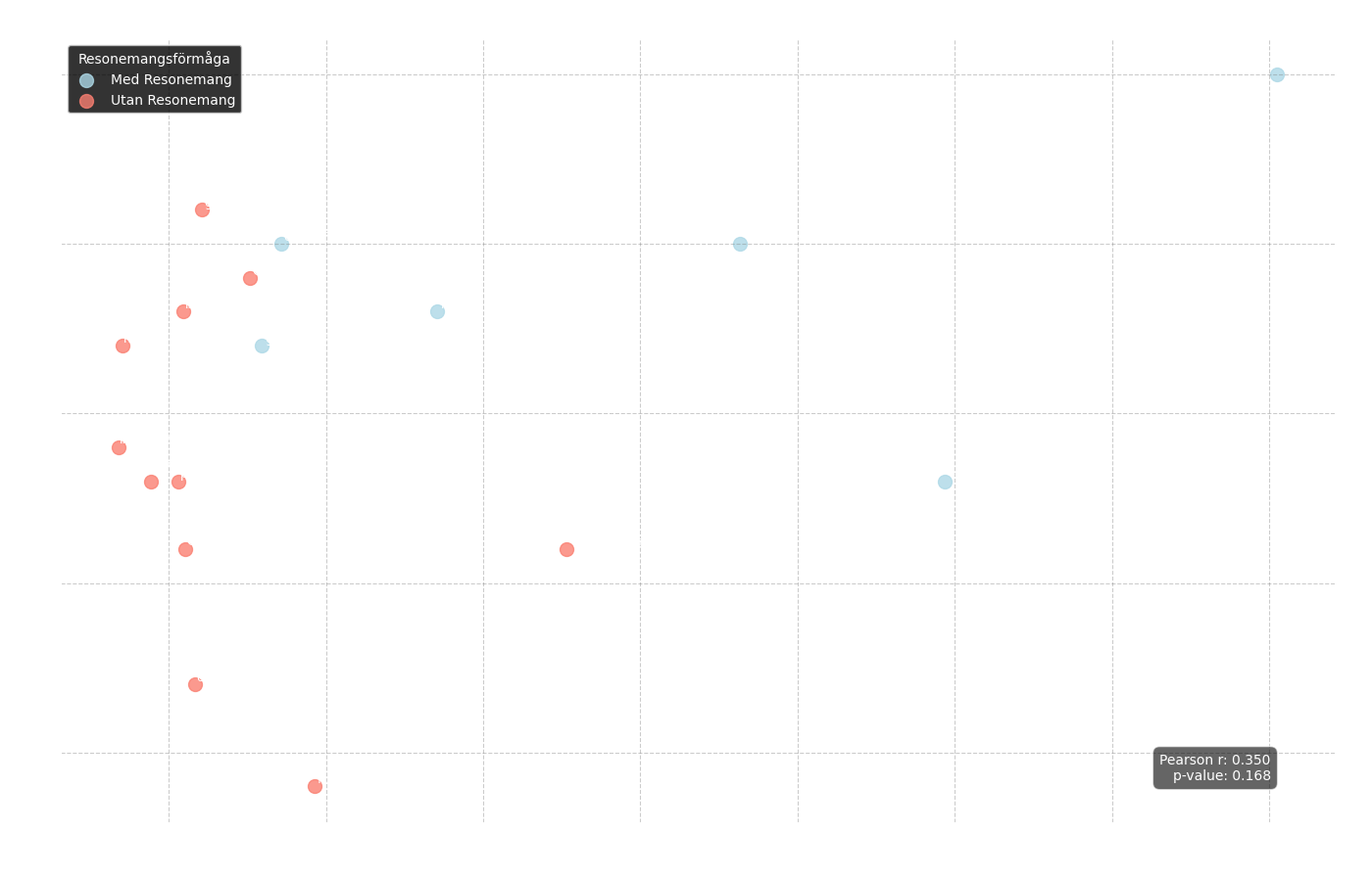 Figure 6: Scatter plot showing the relationship between correct answers (y-axis) and average response time (x-axis). Blue dots represent "reasoning" models and red dots represent standard models.
From this chart, we can first analyze the overall correlation between response time and the number of correct answers:
Pearson r = 0.350
p-value = 0.168
The result is not statistically significant, which means that a faster model was not necessarily better or worse. However, we can clearly see in the chart that the blue dots, representing models with reasoning capabilities, tend to have a significantly longer average response time.
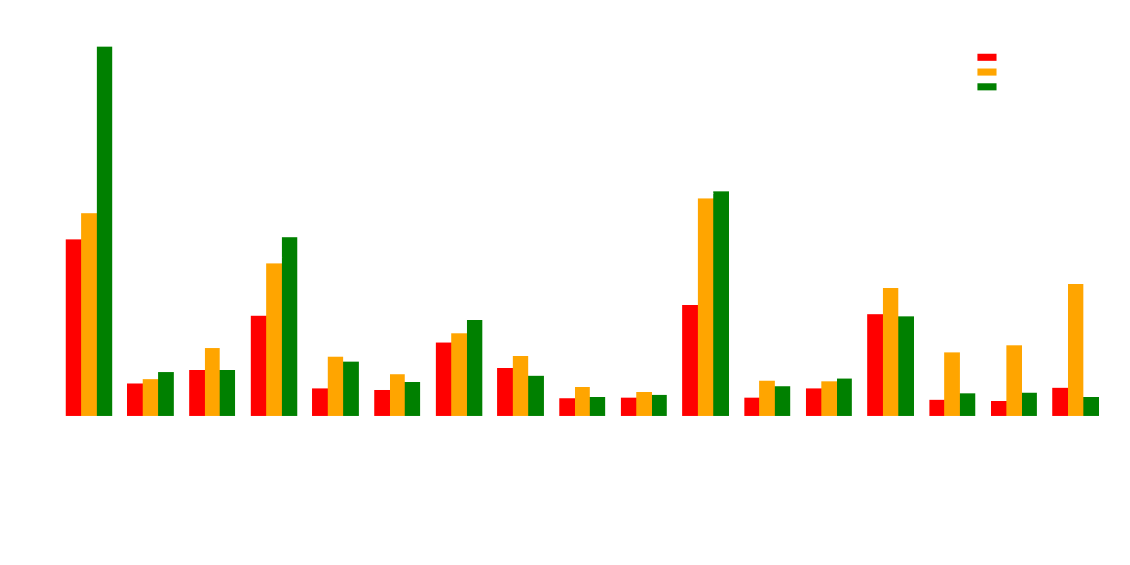 Figure 7: Chart showing the average response time per question type for each individual model.
This becomes even clearer in Figure 7. Here we see that the test winner, qwen3:8b – which is a reasoning model (and thus a blue dot in Figure 6) – is also one of the models that consistently takes the longest to respond. This underscores that more capable models may need more "thinking time" to deliver higher quality answers.
Finally, another interesting time-related correlation was observed: questions that generally took longer for the models to answer had a higher proportion of incorrect answers.
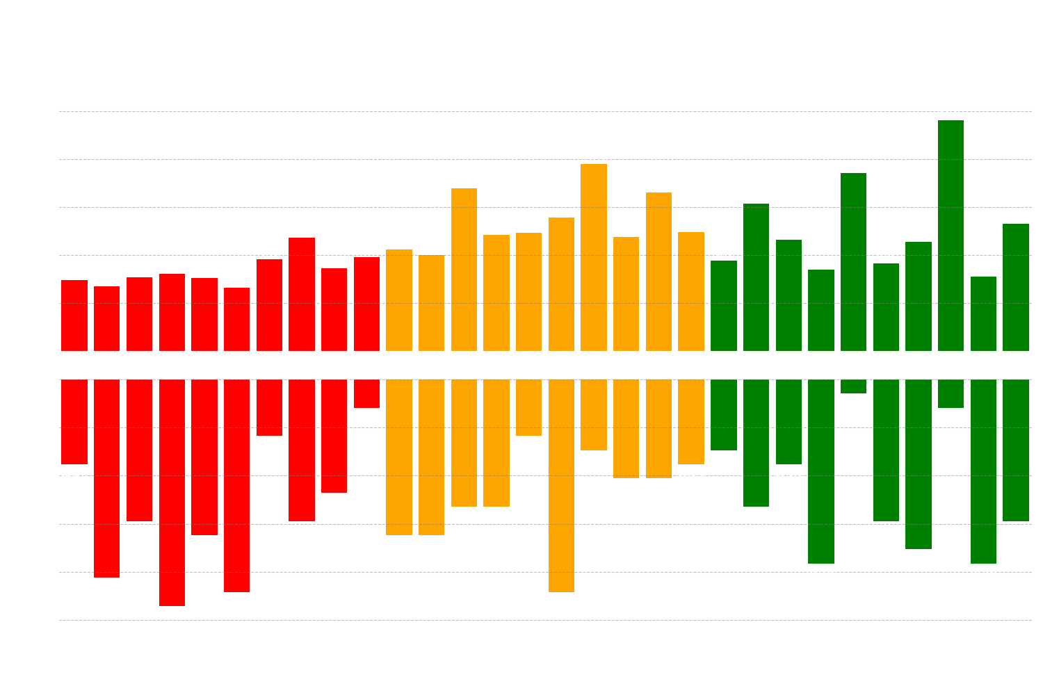 Figure 8: Chart showing the correlation between the proportion of correct answers and the average response time for each individual question.
Correlation: Response Time vs. Correct Rate (per Question)
Spearman ρ = -0.487 (p = 0.006)
Pearson r = -0.515 (p = 0.004)
Here, the result is statistically significant. The negative correlation shows a moderately strong relationship: the longer the average response time for a specific question, the lower the proportion of correct answers for that question. Simply put, when the models "hesitated" and took longer, they were more likely to answer incorrectly.
Analysis of Relationships and Correlations
We could also see a number of other types of relationships and correlations between the performance of different models and their technical specifications. One of the first we examined was the relationship between a model's specified context length (how much information it can "remember" at once) and its total number of correct answers.
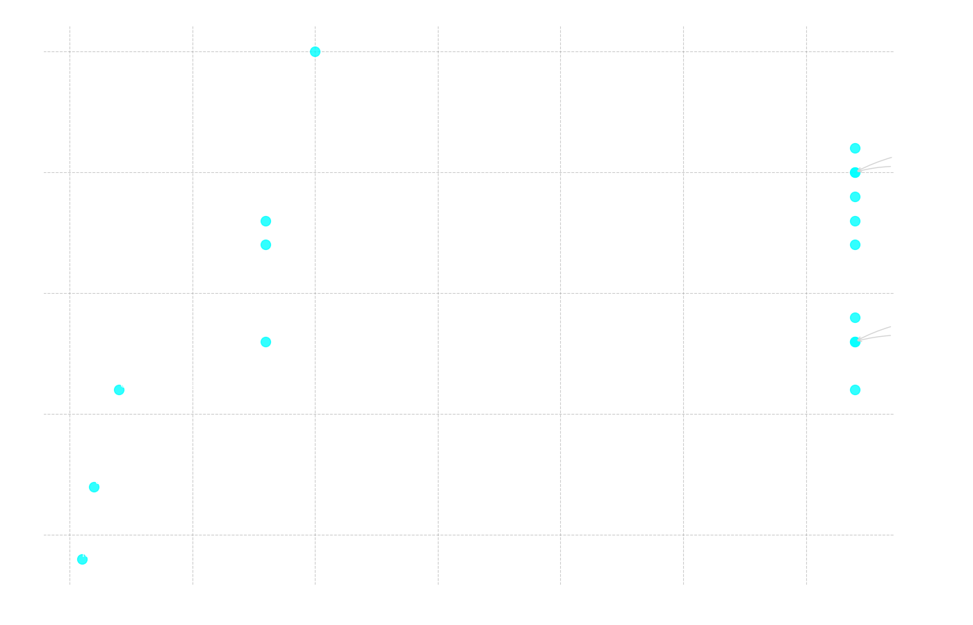 Figure 9: Scatter plot showing the relationship between the total number of correct answers (y-axis) and the model's context length in thousands of tokens (x-axis).
Correlation: Context Length vs. Total Correct
Pearson r = 0.416 (p = 0.097)
Spearman ρ = 0.481 (p = 0.051)
As Figure 10 illustrates, the proportion of incorrect answers increased markedly for the longest text. If we analyze the text volumes, we see why. The longest text (Text 2) has 1134 words. When this text is processed by Gemma's tokenizer, it is converted into 2139 tokens, but for older models with different tokenizers, the same text can generate even more. This far exceeds the context window of a model like fcole90/ai-sweden-gpt-sw3:6.7b, which only handles 2000 tokens. Thus, the model cannot even "see" the entire question and text at the same time, making it impossible for it to answer correctly.
Another interesting relationship to examine was that between the models' release dates and their performance.
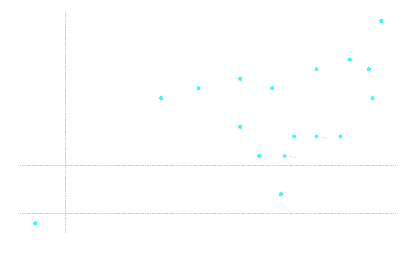 Figure 11: Scatter plot showing the relationship between the total number of correct answers (y-axis) and the model's release date (x-axis).
Correlation: Release Date vs. Total Correct
Pearson r = 0.557 (p = 0.020)
Spearman ρ = 0.437 (p = 0.079)
Here we see a statistically significant positive correlation (Pearson r = 0.557), which confirms that newer models tend to perform better. This becomes clear in Figure 11, where three of the four best-performing models are also among the four most recently launched. At the same time, the models with the lowest number of correct answers are found among those released earliest. This follows a pattern common in all technology: progress moves forward. New models are built on lessons from past mistakes and benefit from the latest research, leading to ever-improving capabilities.
The final relationship we investigated was between the number of parameters in a model and its results.
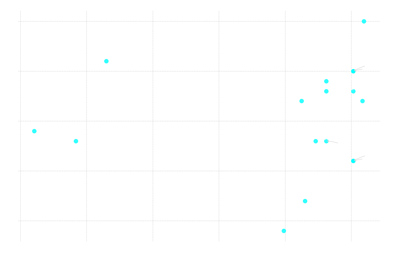 Figure 12: Scatter plot showing the relationship between the total number of correct answers (y-axis) and the number of parameters in billions (x-axis).
Correlation: Number of Parameters vs. Total Correct
Pearson r = 0.099 (p = 0.706)
Spearman ρ = 0.324 (p = 0.205)
Here, the correlation is very weak and not at all statistically significant, which is an interesting result in itself. It shows that "bigger is not always better." An excellent example of this is gemma3:4b, which with only 4.3 billion parameters performed second best in the entire test. As we have seen in previous analyses, this model has other decisive advantages, such as a late release date and a long context length. This underscores that the technical prerequisites for performing well are more complex than just sheer size.
A Closer Look at the Top Models
To get a deeper understanding of what differentiates the best models, we can analyze their performance per sub-section in a radar chart. The test's podium consisted of qwen3:8b in first place, gemma3:4b in second, and a shared third place between cogito:8b and deepseek-r1:8b.
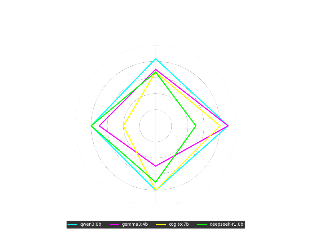 Figure 13: Radar chart showing the percentage of correct answers for the four top models, broken down by sub-section.
The chart reveals clear strengths and weaknesses:
- qwen3:8b was solid and consistent across the board, with over 80% correct in all sub-sections.
- gemma3:4b performed very well on word comprehension and quite well on sentence completion, but had clear difficulties with the more demanding reading comprehension.
- cogito:8b excelled with a top result in reading comprehension (on par with qwen3), but performed weakly on sentence completion.
- deepseek-r1:8b, in contrast to cogito, was the best of all at sentence completion but had greater trouble with word comprehension.
An interesting aspect is that three of these four models (qwen3, cogito, deepseek) are so-called reasoning models. This may explain their strength in complex tasks like reading comprehension. At the same time, this ability can sometimes be a disadvantage in simpler tasks like word comprehension, where a model might "overthink" an initially correct answer and reason its way to a wrong one.
Looking at other specifications, we see that qwen3:8b had the absolute highest average response time in the test, closely followed by deepseek-r1:8b in third highest at about 24 seconds. cogito:8b was significantly faster at 9 seconds, but all three were outclassed by gemma3:4b, which clocked in at just over 5 seconds. All four had sufficiently long context windows for the test, and all except gemma3:4b were around 8 billion parameters.
 Figure 14: A timeline showing the launch dates for the four top models.
Finally, as Figure 14 shows, all four top models were launched within a narrow time frame in the first half of 2025, again confirming that the newest models often carry the latest advancements.
Watch the full test and walkthrough in the video here:
Summary
In summary, the following can be concluded: For those who want the model with the absolute best understanding of the Swedish language, qwen3:8b is the top choice. However, if you want a model that responds faster, is smaller, and can therefore be used on a wider range of hardware, then gemma:4b appears to be a very good alternative.
Resources
- YouTube Video: AI vs. The Swedish Scholastic Aptitude Test
- GitHub Repo (Local Test App): ollama-modelltestare
Models
Here are links to all the models included in the test, sorted by performance (best to worst):
- qwen3:8b (25/30)
- gemma3:4b (21/30)
- cogito:7b (20/30)
- deepseek-r1:8b (20/30)
- Qwen2.5:7b (19/30)
- llama3.1:8b (18/30)
- marco-o1:7b (18/30)
- granite3.3:8b (17/30)
- mistral:7b (17/30)
- llama3.2:3b (14/30)
- deepseek-r1:7b (13/30)
- falcon3:7b (13/30)
- phi4-mini:3.8b (13/30)
- Command-r7b:7b (11/30)
- aya-expanse:8b (11/30)
- olmo2:7b (7/30)
- fcole90/ai-sweden-gpt-sw3:6.7b (4/30)